Home and Revamp User Testing
Requested by: Bryan Hsu (Senior Product Manager)
Contributors: Christy Boelter (Design Associate), Stas Aristov (Senior Product Designer), Dennis Lagman (Lead User Researcher)
Background:
Users come to the app for a more simple, concentrated, convenient, and personalized experience. Current account IA renders miscategorized menus, redundant items, inconsistent items among 3 platforms, lack of sub-menu events tracking, and lack of personalization touch.
Problem Statement:
We are launching design revisions to our app home screen as well as the account details page that we assume will make it easier for users to navigate to different areas of the platform. However, there is a risk that the changes may cause more confusion to our users and negatively impact their ability to take certain actions in the app.
Part One: First Impressions of App Home Screen:
- What do users think about Version A/B and how does it compare against the app home screen today?
- How easy or difficult is it for users to locate where to buy, trade or stake crypto based on the changes made to the app home screen?
Part Two: Usability of Account Settings IA revision:
How easy or difficult is it for users to find specific resources or account-related actions based on the IA revision?
Methodology:
30-minute moderated concept test with existing Binance.US users.
Users were asked to explore a prototype of the current app, share insights, and were asked questions on clickablity. Then users were provided one of two versions of a prototype, sharing insights on what they found to be different, and were asked questions on clickablity.
Audience:
6 existing Binance.US users with varying degrees of trading experience (4 of 6 participants labeled themselves with the knowledge level "my friends call me an expert", 1 of 6 considered themselves a professional trader, and 1 of 6 considered themselves having some knowledge of crypto).
Donovan
Rohan
Jacory
John
Kriss
Justin
-
5 of 6 users reacted favorably to the current app home screen. They were satisfied with the current UX and were able to navigate the application based on their unique needs.
"I actually like the app as it is now because there are a couple of features I like on it. I like that the news is at the bottom.." - Jacory
"I'm pretty satisfied. In all transparency, I do still feel that Voyager was the best mobile app I've used from a user experience perspective. Just the design. The app interaction." - Rohan
"I think that I like that now it's easier to kind of track the progress over a more contemporary timeline. The timelines they had before were more people that were very active traders. They're more interested in the hourly timetable and I like to look more at the long term. So having that availability made a big difference for me." - Donavan
1 of 6 users did not find the app home screen intuitive, mainly for the fact that he only accesses Binance.US via desktop/laptop computer.
" The app is smaller, and it's a little bit more cumbersome for me. I find that the bigger the screen, the better I can move around. So I think I will probably always opt for the laptop over the phone, but it wouldn't mean that I wouldn't use it. I just wouldn't use it as much." - John
2 users felt that the following changes would improve their overall experience of the app:
A way for users to share their portfolio growth without sharing their balance.
Fees the user pays is more transparent as they go to purchase.
-
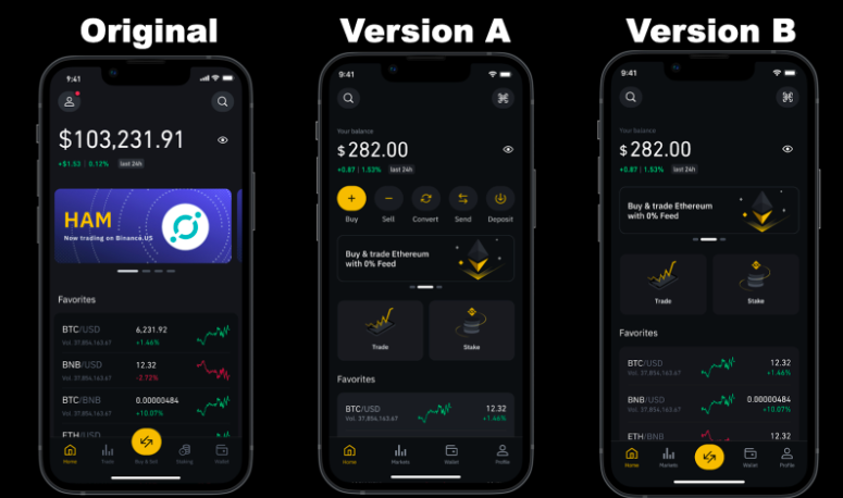
3 of 3 users reacted favorably to Version A and felt that the UI was more intuitive: Users immediately noticed the new placement of the navigation buttons and felt that it was more straight forward when compared to the original version.
"I think that it is a lot more user friendly. I think it's better. I think for someone who is new to this, they will feel a lot more comfortable using the product." - Donovan
"Well, I think it is better because the tools is right at the front of the screen. You don't have to kind of, like, go searching for it or look to another screen." - Jacory
-
1 of 3 users felt that Version B was not as intuitive as the original, as they felt that it would cause issues for users looking to buy and not trade crypto.
"I think it depends on the audience that you're trying to attract, because if you're looking for someone that's just an investor that doesn't trade, they might not think of this as buying sell right here. They might just say trade. Or you can click on right here and you could say Buy crypto. You might want to put something right here where it doesn't exactly" - Justin
-
Challenges with Open orders: Users noticed as they scrolled down on the homepage and had mixed opinions and questions relating to it.
"If I have a lot of open orders and maybe I'm trying to scroll to the bottom and get the new market in the wallet, would it kind of shrink or where I can click on a button and scroll down? Or will it just be long where." - Jacory
"It's not a place that I would normally look for open orders. I'm mixed on this. Some part of me, likes the fact that I can see open orders right in the homepage and I don't need to go to another tab. But some part of me is so used to seeing open orders in, like, a trade area, so it's something I wouldn't expect to be on the screen, the open orders" - Rohan
Ideas for improvement:
Ideas for improvement on Version A or Version B were not specific to one version.
Adding the "Get help" button on the home page in order to address find-ability issues.
Deposit/ withdrawal on the homepage for quick access.
Overall Usability and Comprehension Issues of App Home Screen:
Overall Observations:
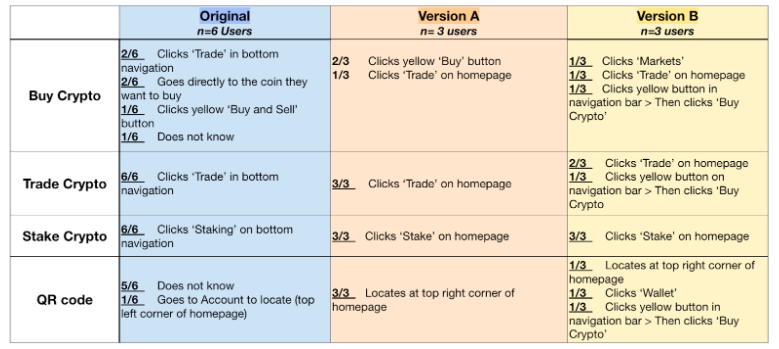
Ease of use: Whether participants viewed Version A or Version B after looking at our current day app, all users felt the app experience was easier upon seeing the 'Trade' and 'Stake' buttons leaving the bottom navigation bar.
"I like the fact that the Trade and Stake buttons are in your face. They're easier for me to click on Trade. That button at the bottom next to Home was a little too small, in my opinion. And this is more, I would say, user friendly." - Rohan
Buying Crypto vs. Trading Crypto: When asking users how would they go about 'buying crypto' many users (4/6) would not look for the buy button. Instead they would look for the coin they are looking to buy itself or click on trading options.
Scanning a QR Code: Majority of users do not understand the complete functionality of the QR code scanner and do not know it can be used to log into the web via your mobile app.
"If I'm depositing or withdrawing, then normally I go to my wallet and click on Deposit or Withdraw, and that's where I would scan a QR code." -Rohan
Usability of Account Settings IA revision:
Overall Observations:
Get Help:
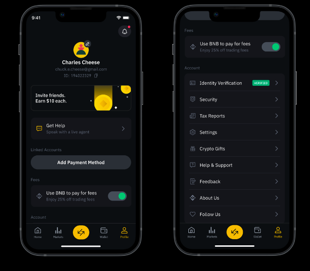
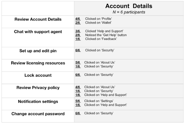
2 of 6 users noticed the new placement of the new 'Get Help' button. Many of the users scrolled towards the bottom to look for this information.
Review licensing resources:
3 of 6 users did not understand what are the licensing resources/ or why they would need them.
1 of 6 user have actually looked up their own state's licensing resources before.
Four screen color variations:
Users were asked if they could see any differentiation in coloring between four screens that were exactly the same screen, but different color variations. All users could not see a difference or had any preference.
Next Steps and Recommendations:
Further research to understand how users view buying crypto vs. trading crypto: In our study 4/6 users clicked "trade crypto" when asked to "buy crypto". The users of our study were existing users with previous knowledge on cryptocurrency. Therefore a further understanding of new users or crypto "newbies" could be conducted.
Using a QR Code Scanner to log onto the webpage: Most users understanding of scanning a QR code is related to buying or trading crypto, not being able to log onto Binance.US on your web browser. When launching the new version of the app, a suggestion could be that users could click through a series of pop-ups explaining the changes. One of the pop-ups could be to educate our users of how to use the QR code scanner.
Get Help: Only 2/6 users noticed the new placement of the "Get Help" Button on the account page. Further research is needed to understand where is a better placement for the button.